
The Dashboard discussed in this project is created with Kibana and is suitable for an IDS feed like Suricata using Filebeat or Logstash. For more information on setting up Suricata as an IDS with ELK (ElasticSearch, Kibana, Logstash, Filebeat), see MY OTHER ARTICLE [LINK].
Dashboard Goal
In this article I want to do a quick reference for how to setup a different type of Dashboard. Filebeat has several Dashboards pre-loaded in Kibana. These are very useful, which I’d like to discuss in future posts. However, I wanted something a bit different. I wanted to create a dashboard that shows events against a timeline, with severity related lists below.
I’m using Filebeat to handle the log transfer to ELK from Suricata, if you use Logstash you might have a slightly different flow, but it should be fairly similar.
Benefits of Timeline Graph
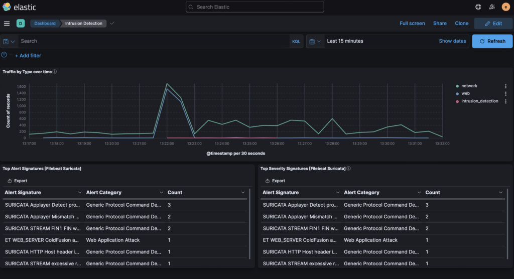
Looking at the above Dashboard, the timeline quickly shows if there has been an INTRUSION. In the example above the INTRUSION is depicted as a RED line. This timeline shows a timeline window when the intrusion was detected to when it stopped.
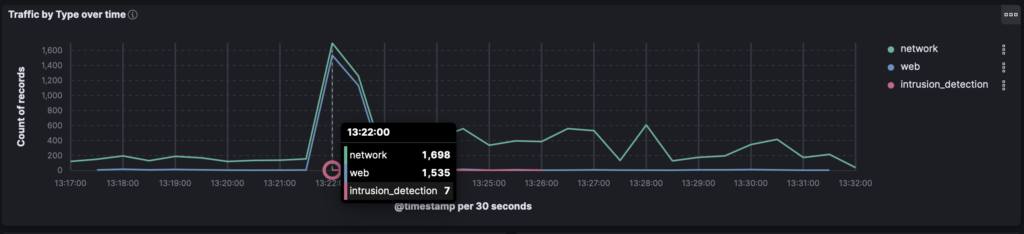
Clicking on the RED line (intrusion_dection), we get the actual metrics. In the example above there were 1,698 network events (benign), 1,535 web events (benign) and 7 events tagged as intrusion attempts.
For more details, I include two tables below the timeline. The left table shows all triggered alerts, including severity 3 (sometimes benign / false alarms). The right table shows all triggered alerts of High Severity (severity 1-2). If you want to know how to create a High Severity table filter, CHECK OUT MY OTHER ARTICLE [LINK].
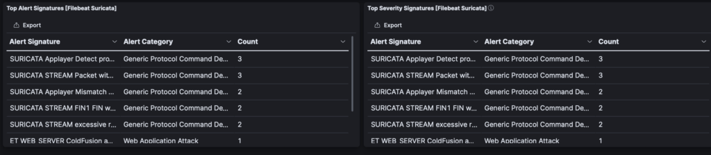
In the example above both tables happen to show the same data. The left table however is set to show severity 1, 2 and 3 events. The right table filters out severity 3.
The overall Dashboard is useful for me, because I can quickly get a visual on intrusion related events, as well as the specific alerts themselves.
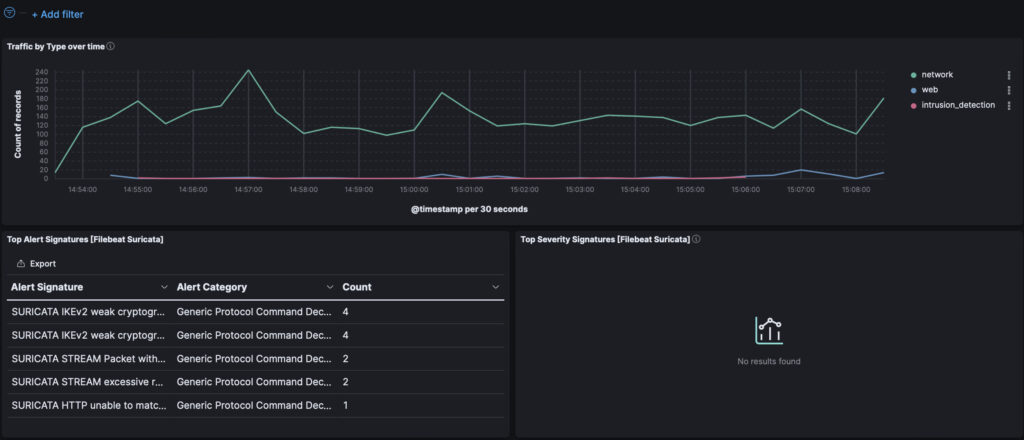
In the next graph timeline sequence, there’s an intrusion detection triggered, but the alerts are all level 3, as the “Top Severity Signatures” table is empty. This is useful to see that while there are alerts they are not High Severity ones, and are likely normal traffic events:
Dashboard Creation
I started by creating a new Dashboard. In Kibana, this is done by going to the Dashboard screen:
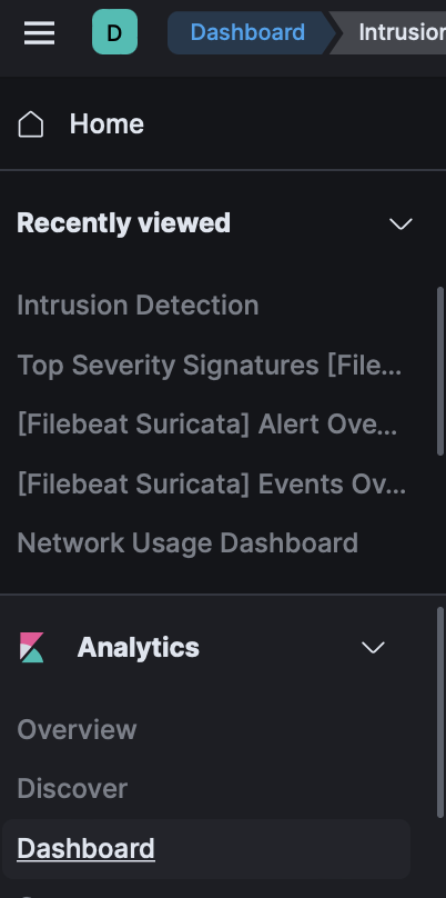
Once logged into Kibana, click on the left side menu (hamburger icon), which will expand like the one in the screenshot to the left.
Scroll down till you reach the Analytics section, expanding if necessary.
Within the Analytics section is the Dashboard link.
Clicking the link, “Dashboard,” will load the Dashboard list. This is a list of pre-made Dashboards that installed with Kibana, Filebeat or your IDS.
On the top right of the screen is a link to Create Dashboard. Clicking the Create Dashboard button will open a creation screen. We start with a blank slate, but we have an option to load in elements from the library. The Library is a collection of data driven widgets used in pre-made Dashboards. You’ll find the “Top Alerts” and other modules in the library.
Creating the Timeline Graph
To make a graph of event types across a timeline, I click to create a new Visualization.
On the left side menu it populates with Filebeat* data elements. I will pick EVENT.CATEGORY, which gives me a list of event types (network, web, intrusion_detection, etc.) Clicking on it opens a popup with sample data from your dataset, a great way to see what you’re about to pull into your chart. I’ll click the “+” sign to add this data point to the visualization.
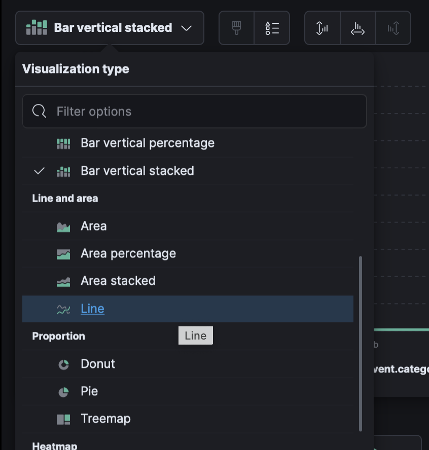
By default it will create a bar chart, based on the counts of each category. I don’t want a bar chart. Clicking on the chart dropdown, I’ll change it from a Bar Chart, to Line.
Initially the line graph will look off. We need to transform it to be based on a timeline record.
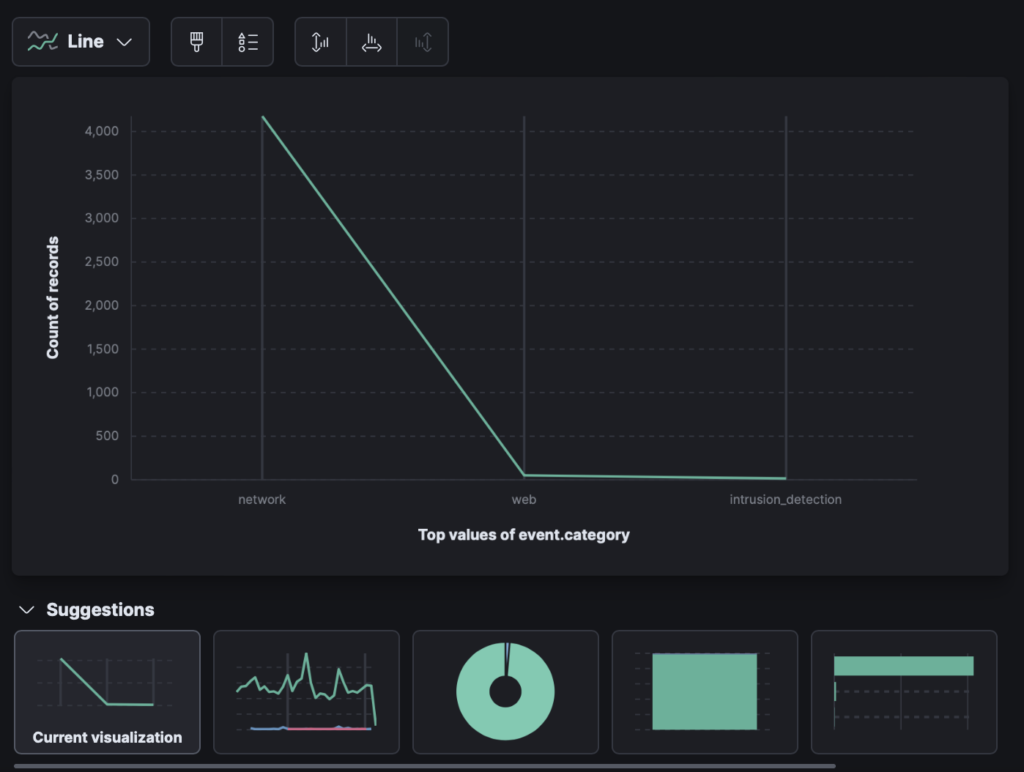
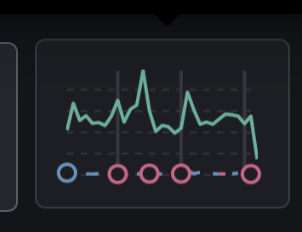
Under the Suggestions icons, the second to the left, will transform the line chart to a timeline based line chart.
After clicking that icon (see screenshot to the left), the data will be charted over a user defined timeline.
Now that the timeline is in place, the table data can be loaded under it – click “save and return” in the upper right and we’ll be able to add more visualizations.
The table I use on the lower left already exists in Kibana. I find it by clicking “Add from Library” and then look for “Filebeat Suricata.” Since I’m using filebeat as my protocol I find the data widget, “Top Alerting Signatures [Filebeat Suricata]”.
Once I select that, it will slot it under the timeline graph. If it slots it to the right of the timeline graph, you can adjust the timeline graph by dragging it from the lower left controller, and drag to the right. That will move the alerting table widget to the bottom left.
The “Top Alerting Signatures [Filebeat Suricata” widget is reporting alerts of all severity. I also want to include a table of the highest severity (1 and 2). To do this I create a High Severity widget, and slot it to the right.
Rather than reiterate how to make a high severity table, I’ll link to a previous post which discusses it [LINK].
Where to go From Here
What might be useful is to add a third row which shows the event table. When clicking on an alert in the alert tables, we can then filter for the event data itself.
If you want the line items with the data details, add from the library, and pick (if using Filebeat/Suricata), “Alerts [Filebeat Suricata]”. Stretching the table across the bottom 3rd row will now provide the details of all the filtered alerts.