Whether you’re using NGINX, HAPROXY or something else, ELK can be a useful tool in creating a dashboard for the log events of your load balancers. While this post is specifically covering load balancers, ELK can be configured for a variety of applications. As long as there are descent data events in the logs, ELK is a great resource to visualize and study data.
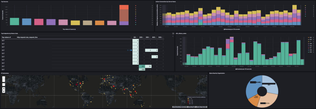
The dashboard and visualizations built within the ELK stack are excellent and work well when filtering down a data element. Below is a sanitized dashboard that shows the capabilities of ELK. We have bar graphs, stacked bar graphs, data tables, geographical maps and donut visualizations.
Filebeat
I have instructions for setting up Filebeat in a different post. However, when installing a Filebeat module (such as NGINX), keep in mind that any processing done to the logs needs to be handled in the module yaml and not the filebeat.yml.
The reason for handling the parsing or processing of log data in the module yaml (i.e. /etc/filebeat/module.d/kafka.yml) instead of the main filebeat.yml is due to competing control of the log file(s). If the filebeat.yml references a log, or log directory (/var/log/*) and the module references the same log or log directory, there will be issues when both yml files attempt to process the same file.
While it may be tempting to put all the processing in the filebeat.yml, it will prevent the use of the modules pipelines. When a module is installed (i.e. Kafka), it adds specific graphs and pipelines to ELK. However, if the processing of the logs is handled in the Filebeat.yml the processing will be handled by filebeat.yml but the processing and visualizations from the module will not be used.
For this reason the module yaml needs to be the one used for processing or parsing.
Installing Filebeat Modules
Once filebeat is installed, a module can be installed using the syntax below:
sudo filebeat modules enable [module name]For a list of modules available to Filebeat, here’s a link to their main documentation showing the entire list available.
Editing the Module YML
Edit the YML file of your load balancer, for example:
sudo nano /etc/filebeat/modules.d/nginx.ymlThe file will be fairly simple. If there is a need for further processing or parsing of the data in the logs, it should be handled here.
processors:
  - dissect:
      tokenizer: '%{month} %{day} %{year} %{time} %{-} %{-} %{log_level} %{-} %{error_class}
      field: "message"
The above example would tokenize the logs, adding a set of dissect variables to the log events in ELK. In other words, ELK would pick up dissect.month, dissect.day, dissect.year and so on. These values would be on the matching pattern the tokenizing is looking for.
Useful Dashboard Widgets
Below are some widgets I’ve used in the past.
To start, open ELK and click on Dashboards. Then click “Create Dashboard”. In the new Dashboard space, click to create a New Visualization. On the left side panel will be the fields available. These fields can be dragged into the main space to the right, to start creating a visualization.
Several visualizations will be covered next.
URL Endpoint with Status Code [Table]
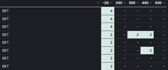
I like this table because it quickly shows what URL is being hit the most often, as well as what status code it tends to return. On the left, I’ve sanitized the URLs from being shown, but one can imagine a list of GET or POST requests with /endpoints/to/some.html
Following the line item to the right, there’s several columns of status codes, 200, 300, 400, 500. These were manually setup as buckets for capturing any value between 199-300, 299-400 and so on. As results come in, they are tallied into those buckets and a quick scan of the last two columns (400 and 500) show exactly what is throwing errors.
Here’s how to create this table:
If you get a raw_request_line or any data event in the log that shows the URL/endpoint requested, drag it into main visualization area. It may default to a graph, change this visualization to become a table.
At this point, you’ll have a list of requested endpoints from your load balancer with a count at the end.
To add the status codes, look for a field like: http.response.status_code
For more information on http.response codes, check out the official docs.
Drag that field into the table. They may need to be re-arranged, so they are in the right position.
On the right-side of the visualization screen, there’s a panel showing the data used for the rows and columns. Under the “rows” section, click not he data item to open it up (i.e. click “top values for http.request…”)
Change the number of rows to 100 or more.
Close the Rows edit screen, and back at the main table edit, look under the column section. Click on the http.response.status_code data element.
Click “Intervals” and then use the “Intervals granularity” to set the granularity of the buckets. This may work without any need of creating buckets.
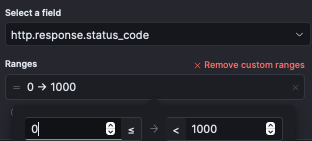
If it doesn’t capture the data correctly a custom interval can be created using the Create custom range link.
When you click “Create custom range” a range will open up, as in the image to the left. In the first field, enter 199, and in the second field enter 200. Click to add another range, and continue on until all status code ranges are covered.
When complete, one or the other solution should show a grid of status codes and a count in each cell.
Very useful for quickly finding what endpoints are generating 500’s!
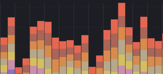
Active Connections by Server
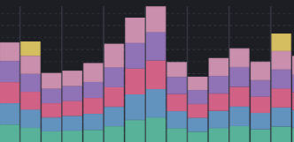
To the left is an example stacked vertical bar graph that shows all the active connections by Server. Consider a situation where several production servers are receiving traffic. The load balancer should have a variable available to capture this. It might be a variable such as connections.active, etc.
Using a stacked, vertical bar graph highlights the active traffic on each server. It’s a quick way to discover a server with heavier load than normal.
To create such a graph, create a new visualization within ELK.
Time the @timestamp variable in the left side nav and drag it over to the main visualization area.
Depending on the load balancer used, there will be a variable that captures active connections. Find the one being used and drag it over to the graph.
Set the graph to be a stacked bar.
The Horizontal axis should be @timestamp and the Vertical axis should be the connections.active or active.connections.
The load balancer should also be collecting the server name as a variable. That can now be dragged over to the right side section called, “Break down by”. Once added, it will create the stacks in the bar graph. Each section of the bar graph is a different server.
Geographic Data
Creating a map with points of sources should be easy enough. Load balancer modules (NGINX or Haproxy) will create these types of visualizations in Kibana. To find the visualization, click Add Visualization from Library (this is a button found on the dashboard edit page).
After clicking “Create from Library” enter the name of your module or load balancer in this case.
ELK will filter down to the visualizations that came preloaded with that module installation. Geographic data is very common and likely available. Select the visualization and it will load into the Dashboard being created/edited.